YES! DATING APP
Sparking Connections through Unique Event-Based Dating
Background
The app was designed mainly for iOS. It was designed for people who wanted to meet new people through experiences and wanted to build relationships along the way. I designed and managed the product development from mid-start to ready to launch stages.
Year
2021-2022
Industry
Dating
Role
Lead Product Designer and PM
Timeline
1 year and 6 months
Stakeholders
1 Product Manager and Product Designer, 2 Engineers, and Yes! Founders
Tools
Figma, Testflight, Asana and Slack
Project Overview
The Challenge
How might we improve the user interface and user experience of the Yes! dating app to streamline the onboarding process and improve the navigation so that more users are activated and the app has boost in engagement?
Goals for the app
Usability
By making the interface more visually appealing and intuitive, it can ensure users find the app engaging and easy to use. Streamlining the onboarding process and improving navigation are key to activating more users and boosting engagement.
Business
Increase user activation and engagement to achieve higher user retention rates, contributing to the app's growth and success in the competitive dating app market.
Key Research
Identify market opportunity
Goal:
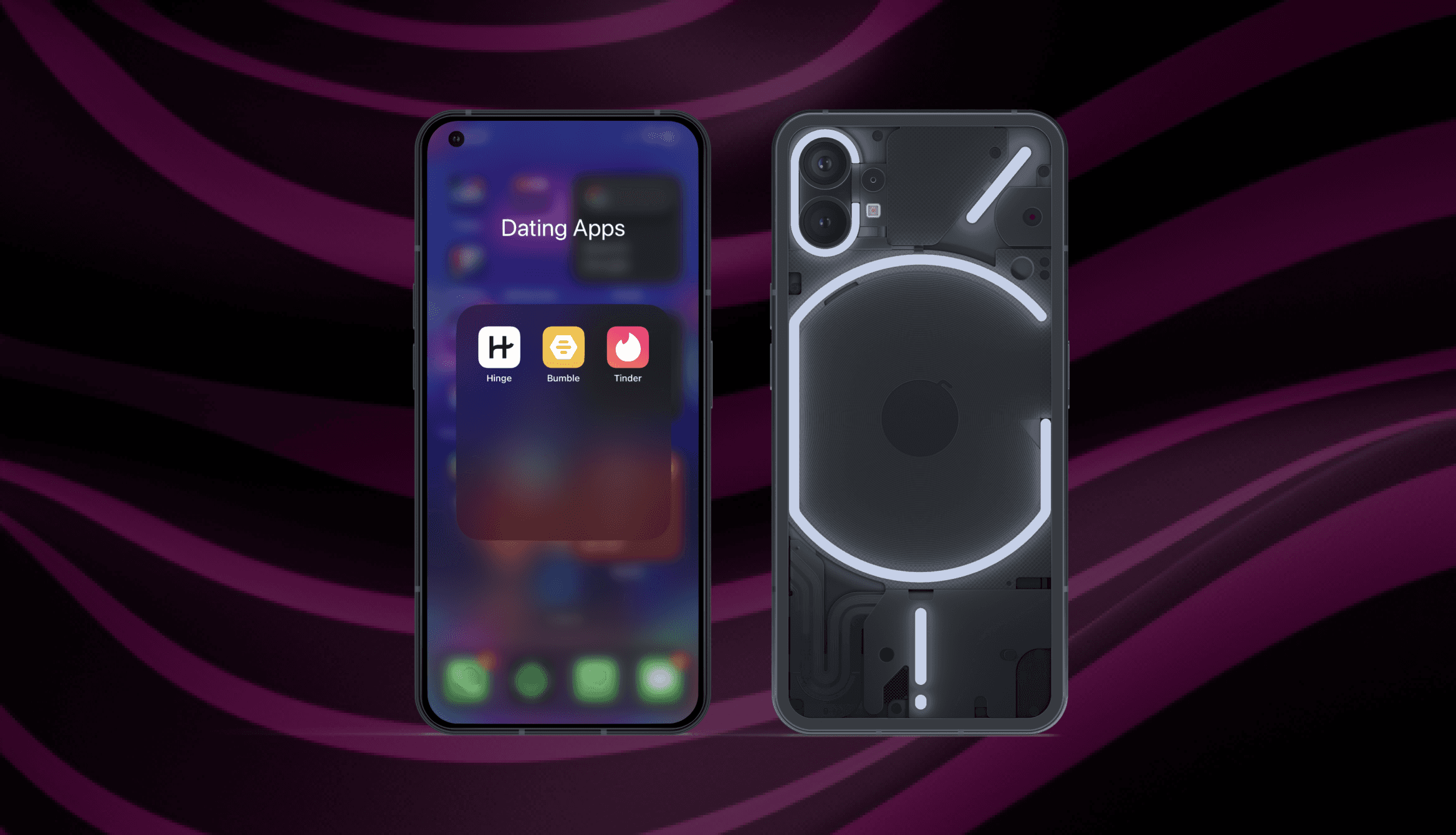
Understand the landscape of current dating apps, including Bumble, Tinder, and Hinge by identifying common product features and potential opportunities that help Yes! to differentiate itself in the competitive dating app market.
Results:
By analyzing these apps, I was able to identify that the user experience is based on profiles and target different user types based on the type of relationships they are looking for. However, users are not able to connect through experiences they would like to enjoy together. Also, users were not able to share their experience alongside their friends as profile sharing or event promotion is not allowed in these apps.
Understand User Needs
User Interviews
User interviews were conducted weekly with potential users to gain insights into their needs, preferences, and pain points. These conversations provided valuable firsthand information about their perspective as dating app user, helping me to understand what users expect from the Yes! app.
By conducting these interviews, I was able to inform my design decisions and prioritize feature implementation based on potential value.
Design and Development Sprints
As usability testing was done weekly with potential users. I needed to plan with the team weekly design and development sprints. This agile approach allowed me to validate design concepts and quickly iterate as needed, making improvements and adjustments based on real-time feedback.
Product Requirements
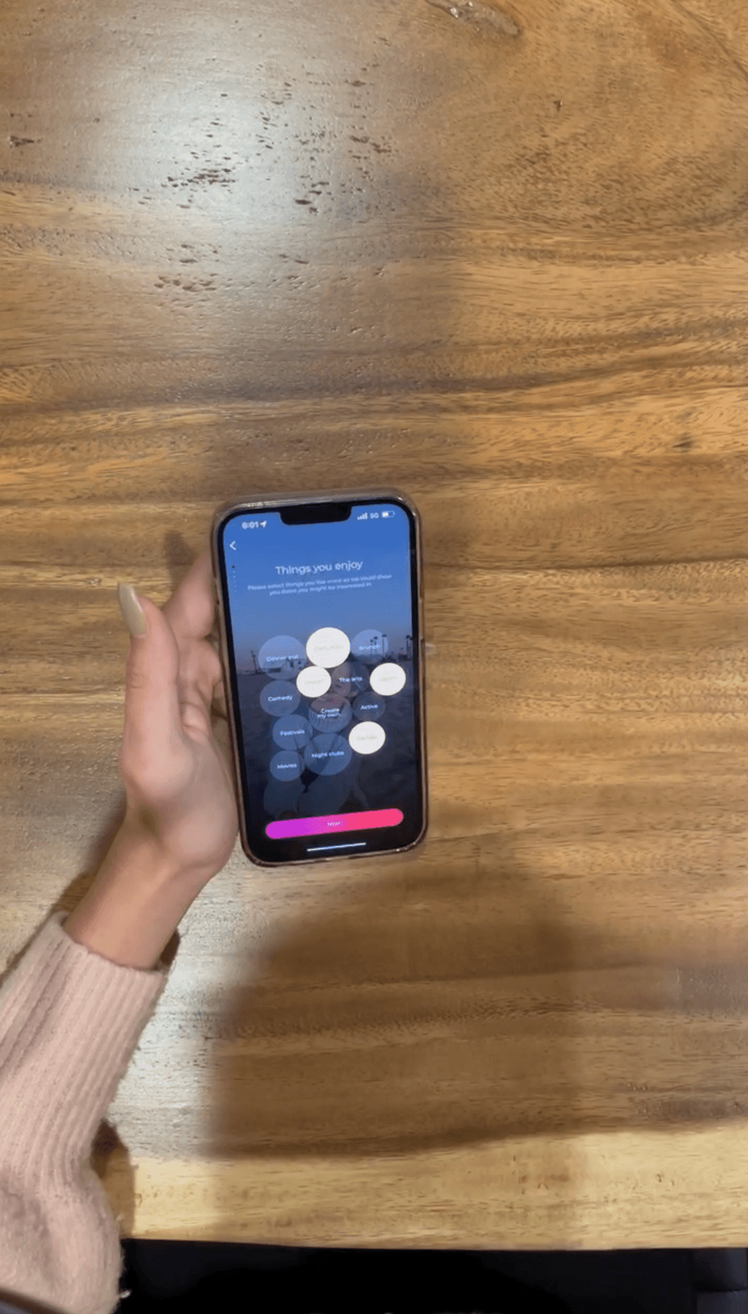
User-friendly onboarding so that users feel empowered when creating their About Me.
The Home screen needs to encourage users to keep scrolling and discover new dates.
Users should have the option to invite friends to create double or group dates.
Seamless navigation across the app so that users can explore each app feature.
Users' identity needs to be verified to create a safe space for dating.


Design Process
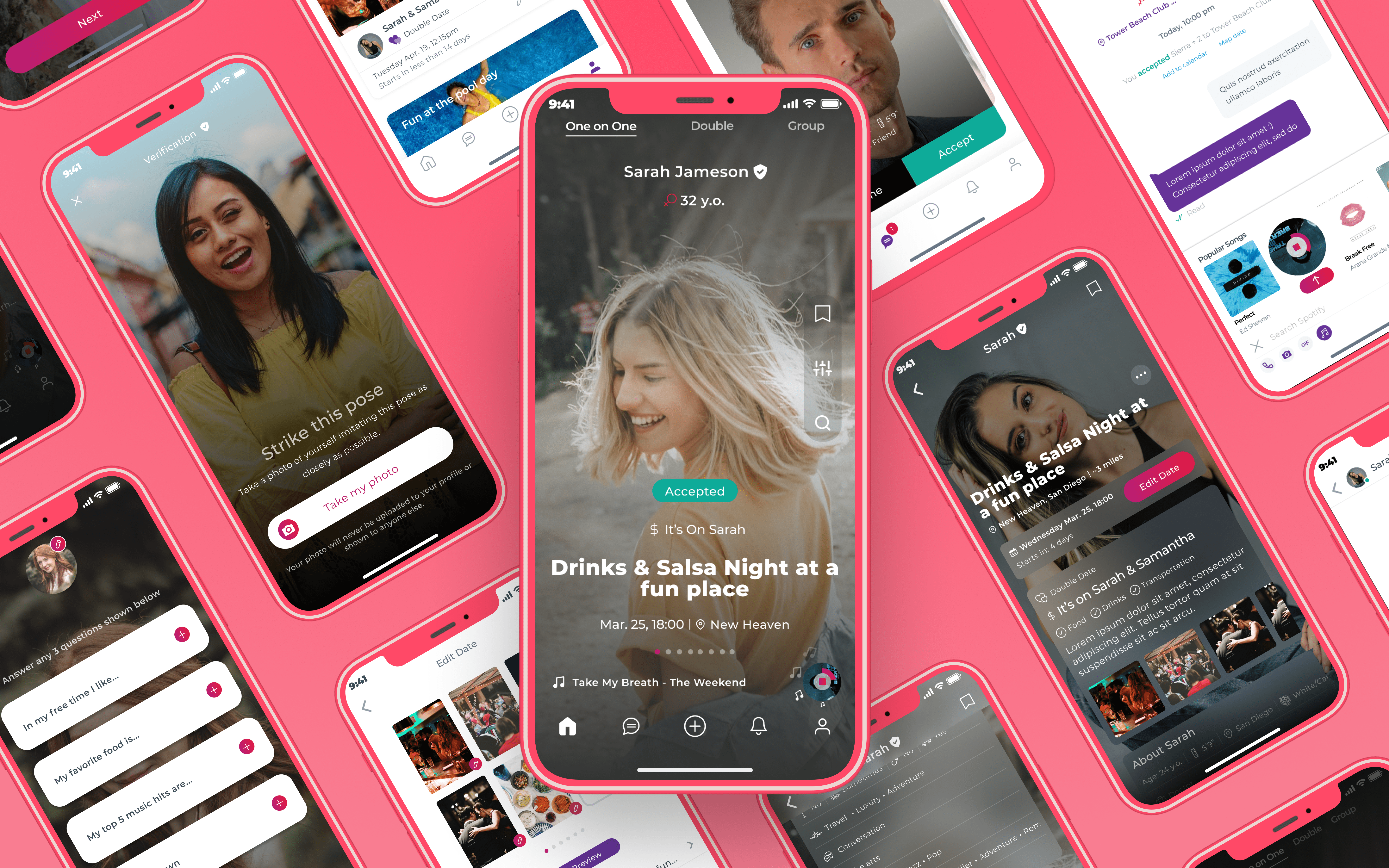
Challenge #1: Onboarding
Problem: Users Activation rate
User activation was defined as the completion of the full onboarding process, including the creation of their 'About Me' section. However, I noticed a significant drop-off at this stage.
Through usability testing sessions, it became clear that users were struggling to write about themselves and decide what information they wanted to share to make their profiles more appealing. This insight helped me to identify a key area for improvement in the user onboarding experience.
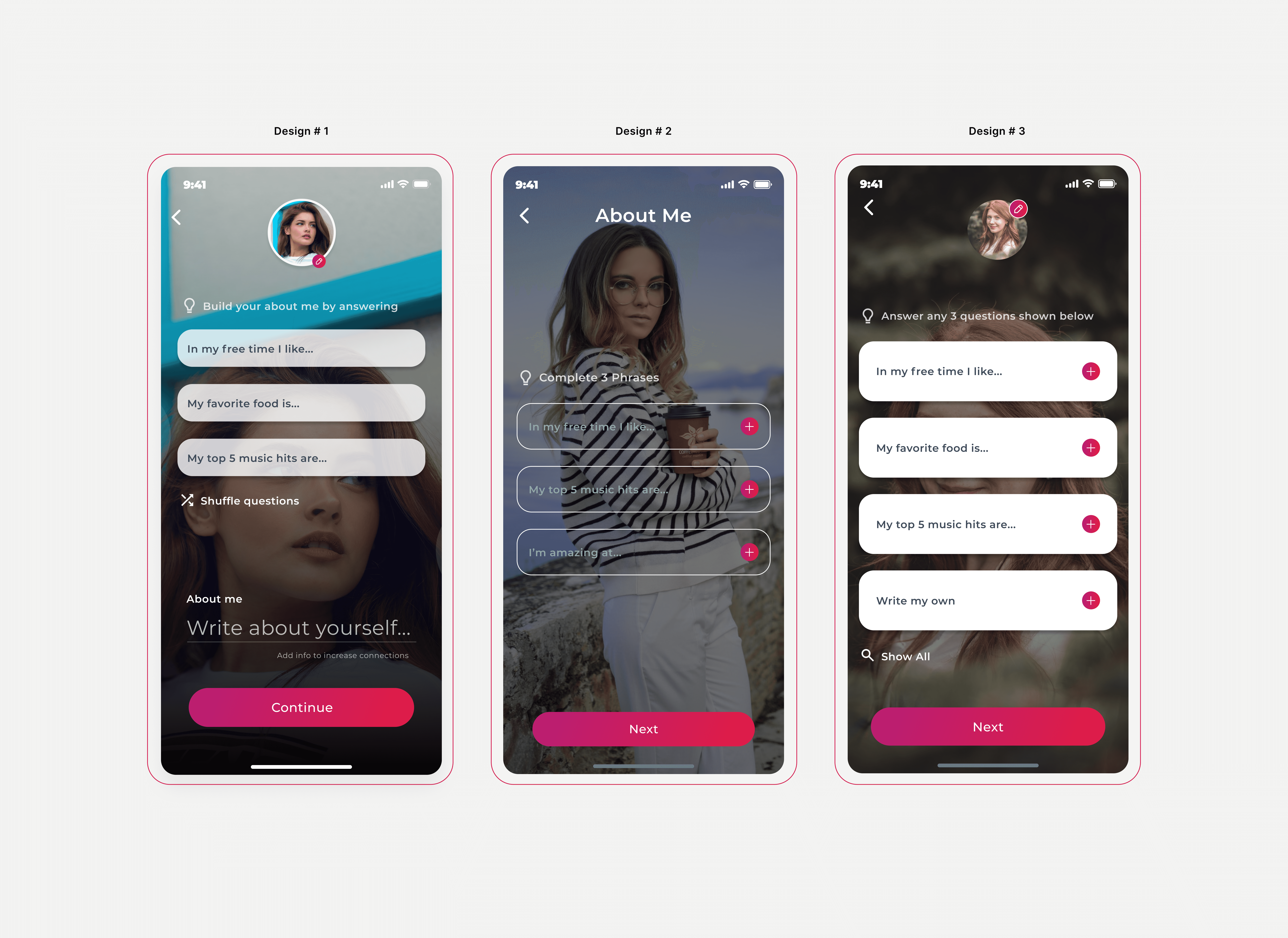
Solution: Quantitative A/B Testing
I conducted quantitative A/B testing with users, focusing on the 'About Me' screen. Initially, users were given the freedom to write their own profiles, but this approach was ineffective. To address this, I designed default prompts to guide users in building their 'About Me'. However, feedback indicated that some prompts didn't resonate with all users, who desired the option to write their own content.
In response, I asked for their input during testing sessions on the types of prompts they'd prefer for their 'About Me'. This approach provided over 100 unique, humorous prompts that users enjoyed adding into their profiles.
Challenge #2: Home screen
Problem: Enhancing Date Discovery
Users where not engaging with the Home screen as expected as the way of discovering dates was not as intuitive as they were swiping left and right, creating confusion between existing app behaviour from previous apps from the market and the Yes! app concept.
Therefore, I identified some opportunities for improvement based on users behaviour and usability in order to facilitate an easy and engaging discovery of potential dates, enhancing user experience.
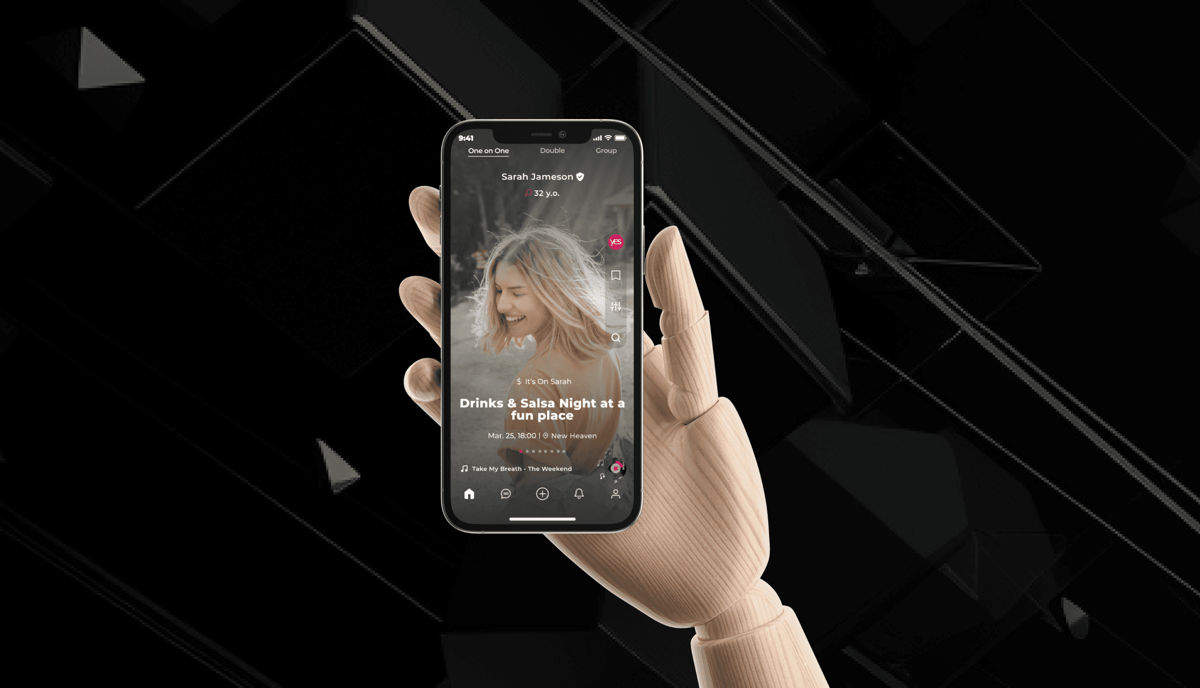
Solution: Revamping the Home Screen
Instead of replicating the same user behaviour that current dating app's have, I got inspiration from popular social media platforms where users spent time often. Therefore, I designed a TikTok-style scroll functionality and screen look that allowed users to easily browse through potential dates without thinking about the swiping to accept or decline concept. This design solution made the date discovery process more engaging and user-friendly, leading to users spending more time scrolling through dates and feeling that they were constantly having new dates to choose from.
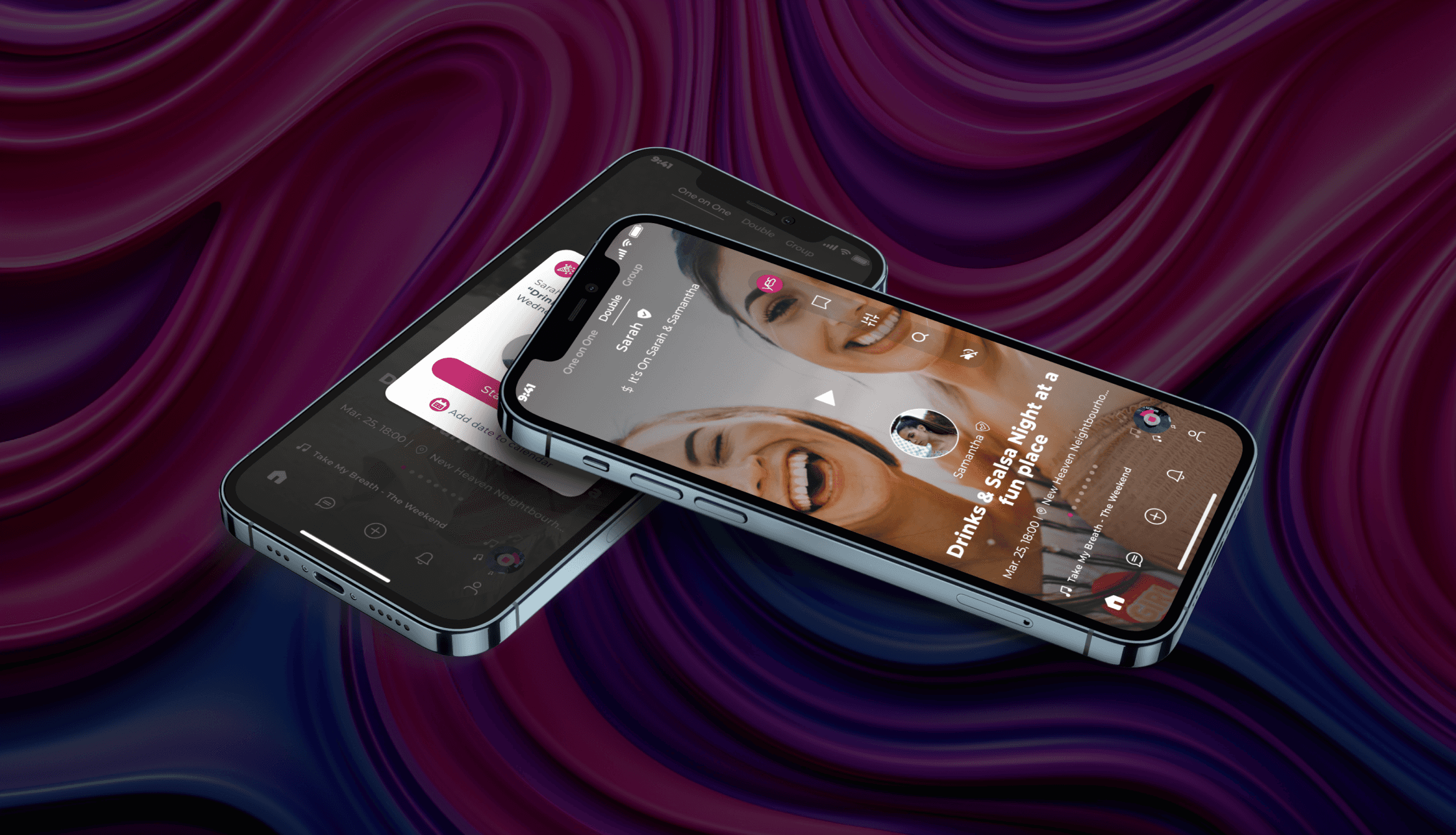
Challenge #3: Double and Group Dates
Problem: Double and Group events
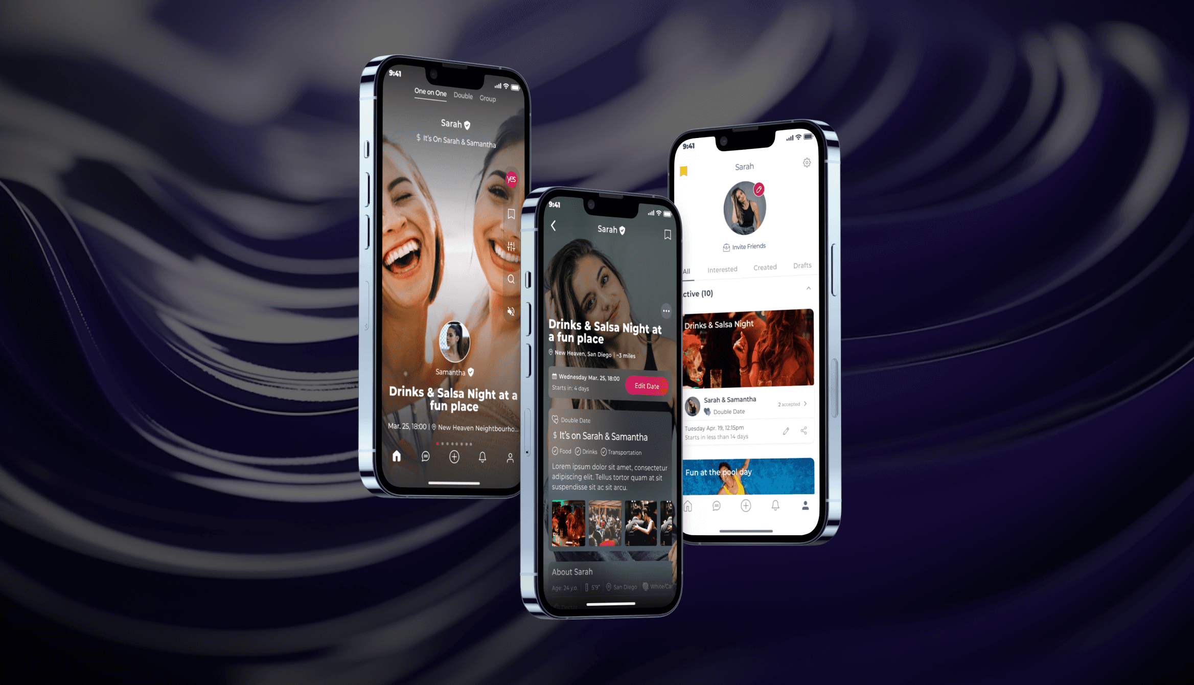
The existing design of the Yes! app did not provide an intuitive or straightforward way for users to create double or group dates. This feature, while unique and potentially appealing to users, was not being used due to its complex setup process. Users found it difficult to navigate through the steps required to set up these dates, and the process of inviting friends to join was not as seamless as it could be.
This design challenge was about making this unique feature more accessible and user-friendly, thereby enhancing the overall user experience and setting the Yes! app apart from other dating apps.
Solution: Revamping the Home Screen
I focused on redesigning the date creation feature to make the process of setting up double or group dates more intuitive and straightforward. I started by simplifying the steps required to set up these dates, reducing the complexity and making the process more user-friendly. I also worked on improving the functionality for inviting friends to join these dates. I designed a seamless invitation process that allowed users to easily select and invite friends from within the app. This redesign not only improved the user experience but also encouraged more users to take advantage of this unique feature.
Results, Reflections and Next Steps
Results
Enhanced date discovery feature and a more intuitive process for setting up double or group dates. Also streamlined the onboarding process which resulted in an activation rate of 37%+ as more profiles were completed, therefore, increasing user engagement at the same time.
My Reflection
This project was a valuable learning experience, highlighting the importance of user-centred design and iterative testing. It reinforced the idea that understanding user and business needs is key to creating a product that not only meets but exceeds expectations.